As a Product Design consultancy, one of the many challenges we have when developing new products is Ergonomics.
Most products by their nature require human interaction in some form, from button accessibility to 24 hour a day wearable technology. How products work with people and how we can potentially improve people’s interaction with a product, can make a significant difference to a product’s success.
At i4 we work with appropriate ergonomic data sources and apply this wherever necessary through carefully calculated CAD measurements, test models and user groups.
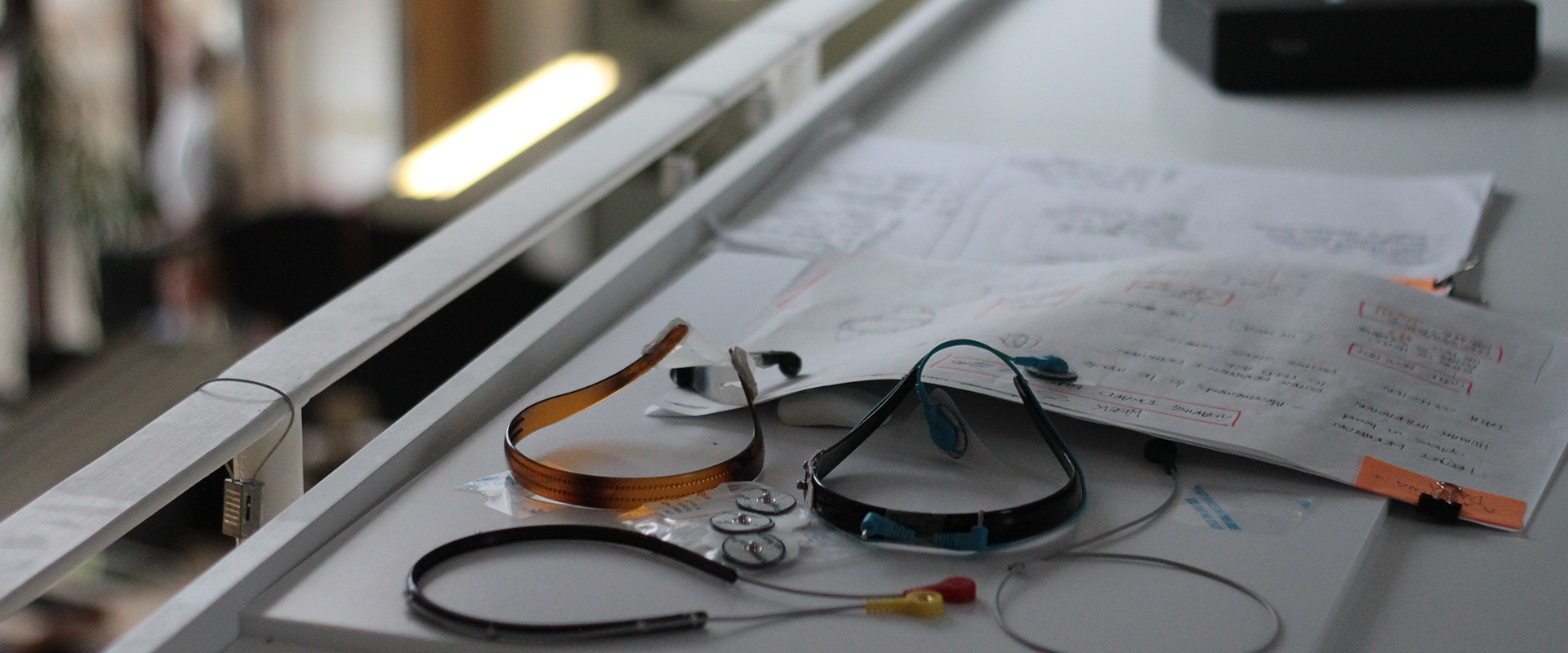
One sample project that featured ergonomic requirements was a novel wearable product that would act upon a specific area of the user's head. The target global market for the product was very wide and as such involved complex requirements.
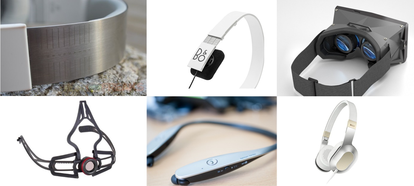
As shown in the product examples below, there are several approaches to creating a product that can be made to fit a wide variety of headsizes; solid-state (but flexible), slide and pivot features and modular parts to name a few. Each have pros and cons including among others; restrictions with material choice, manufacturing methods and user functionality.

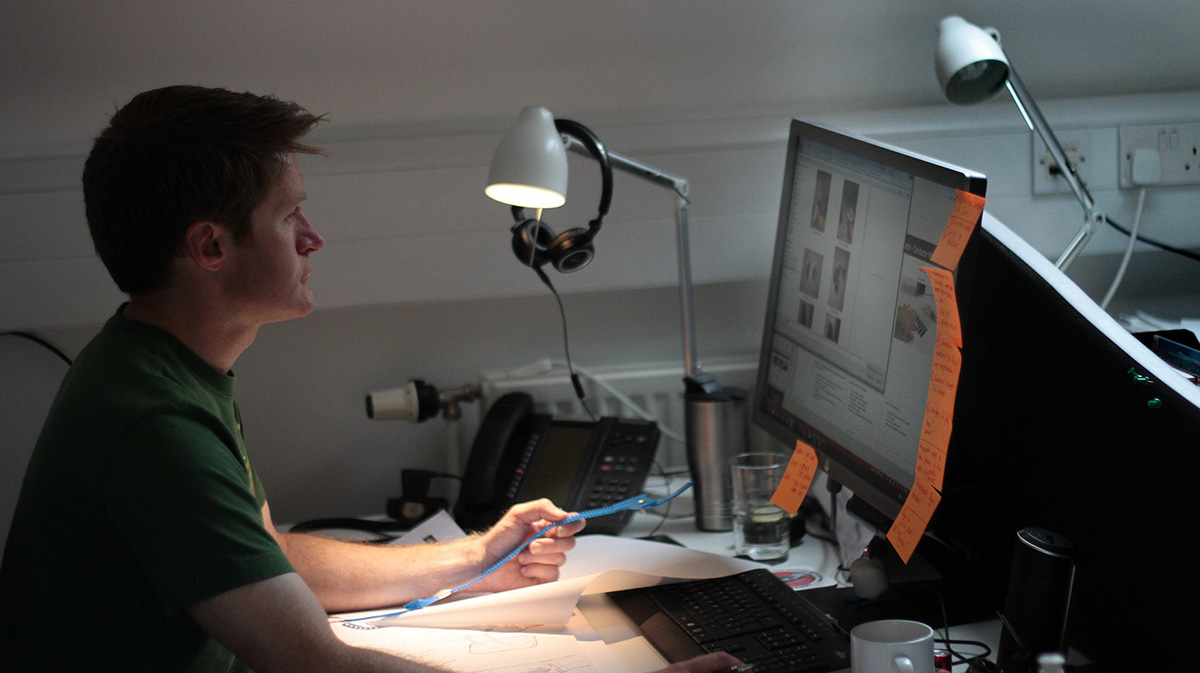
As with most projects, we started with initial sketches and sketch visuals to clarify direction and market acceptance; taking into account size/weight/balance of components such as outer case, PCB, and other electrical components. Having reached an overall appearance that the client was pleased-with we then applied appropriate ergonomic data to achieve a real-world fit that could be tested. Often some of the more specific ergonomic measurements are not recorded in standard documents, and need to be accrued either by a specialist ergonomic lab or via more simple in-house methods, depending on the accuracy required. It’s worth noting that if this information isn't readily available it can add additional time to a project. In this case the client was made aware of the level of complexity involved with fit at a very early stage and the project plan customised to suit.
Our approach to adjustment was to use a flexible solid-state unit (an assembly of parts, but fixed), as it was deemed more appropriate for the target market, product type and manufacturing price point. Incorporating adjustment wasn’t found to be the optimum solution in this case. Added complexity and timescales from creating additional parts, along with increase in size to accommodate wall thickness around adjusters would’ve increased the overall dimensions (something we were keen to avoid). We pursued with creating CAD geometry that allowed for variance in both head size and comfort of fit, using material choice and geometry to give us the flexibility we required.

Once we had CAD geometry that we were satisfied would meet the ergonomic data and manufacturing feasibility, we utilised our 3D printer to create a series of accurate prototypes for functional trials. When developing a wearable product such as this, the subjective nature of “what was a comfortable fit?” becomes an important consideration, so this needed to be tried on people. LOTS of people. Calculated trials of three subtly different designs were arranged, consisting of an appropriate section of people. A user questionnaire was compiled in order to gain effective and consistent qualitative and quantitative feedback in addition to visual data. From this we were able to incorporate the findings and make any necessary adjustments in response.
The product is due to be launched in 2017 where we will be able to release further details and images of the product.
Two previous i4 medical device design projects which are now on the market that underwent a significant ergonomic evaluation were the Optos Daytona and California desktop retinal scanning devices. The Daytona retinal scanner is used on healthy people within a high Optometrist environment. The scan by this device only lasts for less than one second and is used by the full range of age groups. The user interface for the device was drastically different from the California model which is used by Ophthalmologists in evaluation of eye conditions in unwell individuals where scans can take up to 20 minutes (with a Fluorescein Angiography).

As seen in the images above, the Daytona is an approachable product with little need for stabilisation of the head. In contrast, the California requires significant adjustment, both of the direct patient interface (brow and chin bar) as well as the scanner head itself (X Y Z adjustment). The first image depicts how the design has evolved from the 200Tx which was very much the status quo head positioning and still persists with Optos' competitors.
Ergonomics / Human Factors are increasingly being recognised as pivotal to the overall safety and efficacy of a product and to the extent that regulators have issued their own guidance documentation. The FDA released their draft guidance documentation back in 2011 with the MHRA slower off the mark only releasing their draft document earlier this year for comment. Follow-us on LinkedIn to keep up to date with our thoughts on the final draft.
Copyright © 2024 i4 Product Design Ltd. All rights reserved. | Privacy Policy